Orange Data Mining for Teens: Visual Machine Learning From Zero to Capstone
Build real machine learning by dragging widgets onto a canvas: load a dataset, clean it, chart it, train a model, test whether it is actually any good, and present the whole thing as a project you can defend.
Syllabus updated August 2026
Recordings are free with a Google sign-in. These recordings show how we teach, not the exact syllabus of this course.
How long this course takes
This course runs 24 classes (12 weeks · 2 classes/week) at 3-4 hours/week recommended. The range allows for background and pace: a complete beginner uses the full span, and a student with prior knowledge finishes sooner. The syllabus below is planned to the shorter end, with margin kept for revision.
For personalised duration planning, call +91 91233 66161 and we'll map a schedule to your goals.
At a glance
- Who it is for
- Beginner-friendly (ages 13-18), no programming experience required.
- Prerequisites
- None. This course is deliberately built for teens who have never written a line of code, and everything is done by connecting widgets on a canvas. Students who already know some Python are not held back, since the Python Script widget lets them extend any workflow School-level comfort with averages, percentages and reading a graph is enough. Every statistical idea used, from distributions to probability thresholds, is taught inside the course when it is needed
- Format
- Live, interactive classes with a real instructor, never pre-recorded videos. Live classes run about one hour.
- Language
- English or Hindi, depending on the batch.
- Duration
- 24 classes (12 weeks · 2 classes/week)
- Weekly commitment
- 3-4 hours/week recommended
- Class size
- Group batches of 5 to 10 students, mini batches of 3 to 4, or 1-on-1.
- Certificate
- Certificate from Modern Age Coders, awarded on passing the final assessment
- Watch first
- Free recordings of real classes for ages 13 and up, free with a Google sign-in. These recordings show how we teach, not the exact syllabus of this course.
- Live demo
- Optional. Enroll directly on this page, or book a free live demo if you would like to meet a mentor first.
How we teach
Deep understanding. Real projects. Expert guidance.
Learn coding, AI and maths through careful explanations, practical demonstrations, and hands-on problem-solving. Our instructors guide you from the foundations to advanced ideas, helping you understand what happens, why it happens, and how to build it yourself.
You will explore concepts step by step, write and improve code, investigate mistakes, ask questions, and apply your knowledge to meaningful projects. Lessons are designed around active participation, thoughtful feedback, and growing independence.
Expert-led live teaching, with practical participation built into every lesson.
- Students explain their thinking.
- Instructors demonstrate, then guide practice.
- Learners code, solve, or build during lessons.
- Questions and misconceptions get attention.
- Assignments receive useful feedback.
- Progress is checked before advancing.
Ready to Master Orange Data Mining Course for Teens: Machine Learning Without Code?
Choose your plan and start your journey into the future of technology today.
Rated 4.9 across 547 Google reviews. Enroll directly, or take a free live demo first if you like. No card needed for the demo. Monthly billing, cancel anytime.
International Students (Outside India)
Billed monthly in US dollars, the same price in every country. Contact us with any questions.
Program Overview
Most teenagers meet machine learning as a black box: an app that guesses the filter, a chatbot that answers, a recommendation that appears. This course opens the box, without asking anyone to learn Python first. Orange is free, open source data mining software built by the Bioinformatics Laboratory at the Faculty of Computer and Information Science, University of Ljubljana, and released under the GNU GPL version 3 or later. Instead of writing code, you place widgets on a canvas, connect them with lines, and watch data flow through the pipeline you designed. That visual canvas is not a toy version of machine learning: underneath, Orange runs the same well established algorithms a data scientist would use, and it is written in Python so the exact same models are available in code later.
Across 24 live classes for ages 13 to 18 you work through the six widget sets Orange ships with by default, Data, Transform, Visualize, Model, Evaluate and Unsupervised, and then push into the Text and Image Analytics add-ons. You will load and repair messy files, read a dataset honestly before touching a model, build scatter plots and heat maps that actually answer a question, train decision trees, k nearest neighbours, logistic regression, random forests and neural networks, and then, most importantly, learn to test them properly with cross validation, confusion matrices and ROC curves instead of trusting a single flattering number. You will cluster data with k means and hierarchical clustering, shrink hundreds of columns with PCA and t-SNE, mine a corpus of text into a word cloud and a sentiment score, and train an image classifier using image embeddings.
Every class is taught live by a real instructor in a small batch, the same mentorship-first method Modern Age Coders has used since 2020 to teach 10,000+ students across 25+ countries. Nothing here is a pre-recorded video. You finish with 24 saved workflows, a capstone data project of your own choosing, and an Orange report you can hand to a science fair judge, a school teacher, or a college admissions reader who asks what you actually built.
What Makes This Program Different
- No programming prerequisite, and no pretending: you build genuine machine learning pipelines from Class 1, using the real algorithms, not simplified imitations.
- Free software, forever: Orange is open source under the GNU GPL v3 or later, so there is no subscription, no trial clock, and nothing to cancel when the course ends.
- Honest evaluation is taught as a core skill, not an afterthought: cross validation, confusion matrices, ROC curves and baseline comparison start in Phase 3 and never stop.
- Real datasets, not tidy classroom toys: you clean missing values, fix wrong variable types, and deal with data that argues back.
- Every class ends with a saved .ows workflow, so by Class 24 you own a portfolio of 24 pipelines you can reopen, edit, and explain.
- A bridge to code, not a dead end: Orange is written in Python, and the Python Script widget lets you drop into real Python inside the canvas whenever you are ready.
Your Learning Journey
Career Progression
Detailed Course Curriculum
Explore the complete week-by-week breakdown of what you'll learn in this comprehensive program.
Topics Covered
- What data mining means in plain language: finding patterns in data that are too large or too tangled for a person to spot by reading rows
- Where you already meet it every day: spam filters, recommendation feeds, fraud alerts, medical screening, and school analytics dashboards
- Meet Orange: free and open source machine learning and data visualisation software from the Bioinformatics Laboratory, Faculty of Computer and Information Science, University of Ljubljana
- Why it is free forever: Orange is released under the GNU General Public License version 3 or later, so there is no subscription and no trial period
- Installing Orange on your own machine: the standalone installer for Windows and macOS, package options on Linux, and confirming the version under Help then About
- The anatomy of the window: the widget toolbox on the left, the canvas in the middle, and the six default widget sets Data, Transform, Visualize, Model, Evaluate and Unsupervised
- Visual programming in one sentence: place widgets on the canvas, connect them with lines, and data flows along those lines from one widget to the next
Projects You Build
- Install Orange on your own computer, open a blank canvas, place a File widget and a Data Table widget, connect them, and take a screenshot proving data flowed from one to the other
Practice & Assignments
Open every one of the six default widget sets in the toolbox and write down one widget from each that you cannot yet explain.
Assessment
A screenshot of your Orange version from Help then About, plus your two-widget canvas with data visible in the Data Table.
Topics Covered
- The File widget: opening .csv, .tsv, Excel files and Orange's own .tab format, and what happens when a file will not load cleanly
- The Datasets widget: browsing the bundled example datasets so you always have something real to practise on
- Data Table: sorting, selecting rows, and actually looking at your data before assuming anything about it
- Data Info: how many instances, how many features, how many missing values, and why that last number changes everything you do next
- Variable types in Orange and why they matter: numeric, categorical, text, and datetime, and what breaks when a type is guessed wrong
- Roles: feature, target and meta attribute, and why choosing the target is the single most important click in a supervised workflow
- The habit that separates good analysts from lucky ones: describe your dataset in one paragraph before you build anything on top of it
Projects You Build
- Load a real .csv you care about (school marks, cricket or football statistics, weather, a game leaderboard), inspect it in Data Table and Data Info, and write a one paragraph description of what each column means
Practice & Assignments
Deliberately load a file with a wrongly typed column, find it in Data Info, and note exactly which widget downstream would have failed.
Assessment
Your dataset description paragraph plus a Data Info screenshot showing instance count, feature count and missing values.
Topics Covered
- Edit Domain: renaming variables, changing a variable's type, merging categories, and reordering values so charts read in a sensible order
- Color: assigning meaningful colours to categories once, so every chart downstream stays consistent
- Column Statistics: spotting the columns that are almost entirely empty, constant, or secretly duplicated
- Select Columns: choosing features, setting the target variable, and pushing identifiers into the meta section instead of feeding them to a model
- Select Rows: filtering with conditions to isolate the part of the data you actually want to study
- Impute: what to do about missing values, and the honest trade-off between removing rows, filling with an average, and modelling the missing value
- The rule that saves projects: never delete data silently, always leave the original file untouched and do your fixing inside the workflow
Projects You Build
- Take a deliberately messy dataset provided in class, and build a five widget repair pipeline that renames variables, fixes types, filters bad rows and imputes missing values, ending in a clean Data Table
Practice & Assignments
Rebuild the same repair pipeline on your own dataset from Class 2 and record how many rows survived.
Assessment
Your repair workflow plus a two-line note on every judgement call you made and why.
Topics Covered
- Merge Data: joining two tables on a shared column, and what happens to rows that have no match on the other side
- Concatenate: stacking datasets that share the same columns, for example three months of records in three files
- Group by and Aggregate Columns: turning thousands of rows into the handful of summary numbers a question actually needs
- Pivot Table: cross-tabulating two categorical variables to see the shape of the relationship immediately
- Transpose, Unique and Select by Data Index: the small tools that rescue a badly shaped table
- Data Sampler: taking a random subset for fast experiments, and the idea of a held-out sample you do not look at
- Formula: creating a new calculated column from existing ones, for example a ratio or a difference
Projects You Build
- Combine two related datasets with Merge Data, create one new calculated column with Formula, and produce a Pivot Table that answers a specific question you write down first
Practice & Assignments
Use Group by to produce three summary statistics from your own dataset and check each one by hand on a few rows.
Assessment
Your combined dataset workflow plus the question you set and the pivot table that answers it.
Topics Covered
- The Preprocess widget: normalisation, scaling, discretisation and continuisation collected into one reusable block
- Why preprocessing choices belong inside the workflow, not in a spreadsheet you edited by hand and cannot reproduce
- Randomize and Purge Domain: shuffling values to test assumptions, and cleaning out unused categories
- Save Data: exporting a cleaned dataset so other tools can read it
- Saving the workflow itself as an .ows file: an XML description of your widgets, their settings and their connections
- The crucial detail about .ows files: they save the workflow and widget settings but not the data, so a shared workflow needs its data file alongside it
- Workflow hygiene: naming widgets, laying out the canvas left to right, and adding notes so a reader can follow your reasoning
Projects You Build
- Turn your Class 3 and Class 4 work into one tidy, annotated, left-to-right workflow, save it as an .ows file, and swap it with a classmate to check that they can rerun it with the data file
Practice & Assignments
Reopen a classmate's .ows file and write down the first moment you were confused; that is a labelling problem to fix in yours.
Assessment
A shared .ows file that a classmate successfully reran, plus the feedback note they wrote.
Topics Covered
- Distributions: the shape of a single variable, and why the average alone hides almost everything interesting
- Reading a histogram properly: bin width, skew, gaps, and the long tail that contains the exceptions
- Splitting a distribution by a categorical variable to compare groups in the same chart
- Box Plot: median, quartiles, whiskers and outliers, and how to read five numbers at a glance
- Violin Plot: when the shape of the distribution matters more than the summary statistics
- Comparing groups fairly: unequal group sizes, and why a difference in medians is not automatically a finding
- Choosing between the three: what question each chart is genuinely the best answer to
Projects You Build
- Build a three-chart comparison of one numeric variable across one categorical group in your dataset, using Distributions, Box Plot and Violin Plot, and write which chart told you the most
Practice & Assignments
Find one variable in a bundled dataset whose average is actively misleading and explain why using its distribution.
Assessment
Your three-chart workflow plus a short paragraph on what the shape of the data revealed.
Topics Covered
- Scatter Plot: two numeric variables, one point per instance, and colouring points by the target variable
- Reading relationships: positive, negative, none, clustered, curved, and the difference between a pattern and a coincidence
- Using size, shape and colour as extra dimensions without making the chart unreadable
- Find Informative Projections: letting Orange rank which pairs of variables separate your classes best
- Rank: scoring individual features by how much information they carry about the target
- Selecting points directly on the chart and sending that selection to a Data Table for inspection
- The trap to name out loud: a strong scatter relationship is correlation, and correlation is not causation
Projects You Build
- Use Find Informative Projections to identify the two most separating variables in a classification dataset, then build the scatter plot it suggests and select the most interesting cluster of points into a Data Table
Practice & Assignments
Rank the features of your own dataset and write down whether the top-ranked feature surprised you.
Assessment
Your scatter plot plus a written interpretation naming one relationship and one alternative explanation for it.
Topics Covered
- Bar Plot: comparing categories honestly, including the axis choices that quietly exaggerate a difference
- Line Plot: showing values across an ordered sequence, and when a line implies a continuity that does not exist
- Sieve Diagram: seeing whether two categorical variables are independent, using the size of the gaps between observed and expected
- Mosaic Display: reading a whole contingency table as areas rather than numbers
- Venn Diagram: comparing overlapping selections from different parts of your workflow
- Chart honesty: truncated axes, cherry-picked ranges, and misleading aggregation, with real examples to critique
- Choosing the chart from the question, not from the chart menu
Projects You Build
- Build a two-variable categorical analysis using Sieve Diagram and Mosaic Display, then present the same finding once honestly and once misleadingly with a Bar Plot, and explain exactly what you changed
Practice & Assignments
Find a chart in a news article or an advertisement and list every choice that shapes how it is read.
Assessment
Your honest and misleading chart pair, plus a written explanation of the manipulation.
Topics Covered
- Heat Map: hundreds of rows and dozens of columns compressed into one image you can actually scan
- Clustering rows and columns inside the heat map so similar things sit next to each other
- Correlations: ranking every pair of numeric variables by how strongly they move together
- Reading a correlation coefficient without over-claiming: strength, direction, and what it says nothing about
- Distances and Distance Map: what it means for two rows to be near each other, and why the distance measure you pick changes the answer
- Normalisation before distance: why an unscaled column with big numbers can dominate every comparison
- Multicollinearity in plain language: two features saying the same thing, and why that matters later when you model
Projects You Build
- Build a Correlations and Heat Map pair on a numeric dataset, identify one pair of variables that are effectively duplicates, and justify which one you would keep
Practice & Assignments
Run the same Distance Map with and without normalisation and describe how the picture changed.
Assessment
Your heat map workflow plus the duplicate-feature decision with your reasoning.
Topics Covered
- The Report system: most widgets have a report button in the status bar that sends the current view into a running report
- Which widgets cannot report, and why: the ones that only pass data along rather than showing a result
- Building a report in the order a reader needs it: question, data description, evidence, and only then the conclusion
- Adding your own comments to report sections so the reader follows the reasoning, not just the pictures
- Saving the report as .html or .pdf to hand in, and as .report so a reader can reopen the workflow that produced each section
- Opening a saved report through File then Open Report, and showing the report view with Shift and R
- Presenting a data finding out loud in two minutes without a single unsupported claim
Projects You Build
- Produce a complete visual story on your own dataset: one question, three charts chosen deliberately, written commentary on each, exported as a PDF report
Practice & Assignments
Give your two minute presentation to someone at home and note every question they asked that your report did not answer.
Assessment
Your exported PDF report plus the list of questions your audience asked.
Topics Covered
- Supervised learning defined: you have examples where the answer is already known, and you want a model that generalises to examples where it is not
- Classification versus regression: predicting a category versus predicting a number, and how the target variable decides which you are doing
- Setting the target with Select Columns, and the discipline of checking your target before every model
- The standard Orange modelling shape: data, then a learner widget, then Test and Score, then results
- The Constant widget: a deliberately stupid model that always predicts the most common class, and why it is the most useful widget in the toolbox
- Why a baseline is non-negotiable: a model that is 92 percent accurate on data that is 92 percent one class has learned nothing at all
- Class imbalance in one picture, using Distributions on the target variable before you model
Projects You Build
- Take a classification dataset, chart its target distribution, run the Constant baseline through Test and Score, and write down the accuracy number that every later model in this course must beat
Practice & Assignments
Find a dataset where the majority class is above 80 percent and state what accuracy would prove nothing.
Assessment
Your baseline score plus a written explanation of why accuracy alone can be a dishonest metric.
Topics Covered
- How a decision tree learns: repeatedly finding the split that best separates the classes, then repeating on each side
- The Tree widget and its settings: minimum instances in a leaf, maximum depth, and when to stop splitting
- Tree Viewer: walking the actual tree your data produced, node by node, and reading the rule at each branch
- Pythagorean Tree and Pythagorean Forest: seeing tree structure and forest diversity as shapes
- Overfitting explained through trees: a tree deep enough to memorise every training row is useless on new data
- Why interpretability matters: a model a human can read is a model a human can argue with, correct and trust
- Reading a tree back as plain English rules you can say out loud
Projects You Build
- Train a decision tree on your dataset, open Tree Viewer, and write out the three clearest decision rules in plain English, then deliberately overfit by removing the depth limit and describe what changed
Practice & Assignments
Change minimum instances in a leaf across three values and record the tree size each time.
Assessment
Your three written rules plus a before and after comparison of the limited and overfitted trees.
Topics Covered
- k Nearest Neighbours: classify a new point by looking at the k closest known points and taking a vote
- Choosing k, and what happens at the extremes: k of one memorises noise, a very large k predicts the majority every time
- Why kNN is the model that most needs normalisation, connecting straight back to the distance work in Class 9
- Naive Bayes: probability-based classification, and the naive independence assumption stated honestly
- Where Naive Bayes shines despite that assumption, especially on text-like data with many features
- Building preprocessing into the model pipeline with the Preprocess widget so the same treatment applies at training and prediction
- Discretize and Continuize: converting between numeric and categorical when a model requires it
Projects You Build
- Compare kNN with and without normalisation in the same Test and Score, add Naive Bayes as a third learner, and write a paragraph explaining the accuracy gap that normalisation caused
Practice & Assignments
Sweep k across five values and plot or tabulate how accuracy moves.
Assessment
Your three-learner comparison table plus the normalisation explanation.
Topics Covered
- The cardinal sin of machine learning: scoring a model on the same data it was trained on
- Train and test split: holding data back so the model faces genuinely unseen examples
- Cross validation explained simply: split the data into k folds, train on k minus one, test on the one held out, repeat, then average
- Test and Score in practice: comparing several learners side by side under identical conditions
- Reading the metrics without cherry-picking: classification accuracy, AUC, F1, precision and recall, and what each one is blind to
- Confusion Matrix: true positives, false positives, true negatives and false negatives as a table of real consequences
- Precision versus recall through a real dilemma: a disease screening test that misses cases versus one that raises false alarms
Projects You Build
- Run every model you have built so far through Test and Score with 10-fold cross validation against the Class 11 baseline, then open Confusion Matrix and describe, in consequences rather than numbers, what each type of error would mean
Practice & Assignments
Take the same model, score it on training data and on cross validation, and record the difference.
Assessment
Your comparison table including the baseline, plus the written consequence analysis of your confusion matrix.
Topics Covered
- Logistic Regression: predicting a probability rather than a bare label, and what a probability of 0.7 actually commits you to
- The decision threshold: why 0.5 is a default, not a law, and how moving it trades precision against recall
- ROC Analysis: reading the curve as every possible threshold plotted at once
- AUC in one sentence: the chance that the model ranks a random positive case above a random negative one
- Performance Curve and Calibration Plot: whether the predicted probabilities can be trusted as probabilities
- Nomogram: reading a logistic regression model as a visual scoring sheet showing which features push a prediction which way
- Regularisation in plain language: penalising complexity so the model does not chase noise
Projects You Build
- Train logistic regression alongside your decision tree, compare them in ROC Analysis, then use the Nomogram to write down the three features that most influence the prediction and in which direction
Practice & Assignments
Move the classification threshold and record how precision and recall trade off at three settings.
Assessment
Your ROC comparison plus the nomogram feature explanation in plain English.
Topics Covered
- Random Forest: many decision trees trained on different samples, voting together, and why a crowd of weak trees beats one strong one
- Gradient Boosting: building trees in sequence where each one corrects the previous one's mistakes
- Support Vector Machines: finding the widest possible boundary between classes
- Neural Network in Orange: hidden layers, activation, and honest expectations about small datasets
- The bias and variance trade-off explained with the models you have already trained
- Predictions: feeding brand new unlabelled data into a trained model and reading the output with its probabilities
- Save Model and Load Model: keeping a trained model so you do not retrain every time
Projects You Build
- Build a six-model showdown, baseline, tree, kNN, logistic regression, random forest and neural network, in one Test and Score, then take the winner, save it, and run genuinely new rows through Predictions
Practice & Assignments
Note which model won on accuracy and which won on AUC, and explain why they can disagree.
Assessment
Your six-model comparison table plus a paragraph defending your model choice on grounds other than the top accuracy number.
Topics Covered
- Unsupervised learning: no target column, no right answers, just structure waiting to be found
- How k means works step by step: pick k centres, assign every point to the nearest, move each centre to the middle of its group, repeat
- The k Means widget, including the option to score a range of k values and let the silhouette guide the choice
- Silhouette score explained: how well each point sits inside its own cluster compared to the nearest other cluster
- Silhouette Plot: spotting the individual points that were forced into the wrong group
- Interactive k-Means from the Educational add-on: stepping through the algorithm one iteration at a time and watching the centres move
- The honest limitation: k means will happily produce clusters even when the data has no real groups at all
Projects You Build
- Cluster a dataset with k means across a range of k, choose k using the silhouette score rather than intuition, then colour a Scatter Plot by cluster and describe each group in plain words
Practice & Assignments
Run k means on deliberately random data and explain why the clusters it returns mean nothing.
Assessment
Your silhouette-justified choice of k plus a written description of what each cluster represents.
Topics Covered
- Hierarchical Clustering: building a tree of nested groups instead of committing to a fixed number
- Reading a dendrogram: where to cut it, and how the cut height decides how many clusters you get
- Linkage methods, single, average, complete and Ward, and how the choice changes the shape of the result
- The Distances widget: Euclidean, Manhattan, cosine and others, and matching the measure to the data
- Distance Map and Distance Matrix: seeing similarity between every pair of rows as an image
- DBSCAN: density-based clustering that finds arbitrary shapes and, unlike k means, is allowed to call a point noise
- Louvain clustering and Self-Organizing Map named as further options for later exploration
Projects You Build
- Cluster the same dataset three ways, k means, hierarchical and DBSCAN, put the results side by side, and write which method matched the structure you can see in the scatter plot and why
Practice & Assignments
Cut the same dendrogram at three different heights and record how the cluster count and meaning change.
Assessment
Your three-method comparison plus a justified recommendation of one method for this dataset.
Topics Covered
- The curse of dimensionality in one example: why fifty columns can be harder to work with than five
- PCA: building new combined axes that capture as much of the variation as possible, in order
- Reading the explained variance curve to decide how many components are enough
- What you lose with PCA: components are combinations, so individual feature meaning becomes harder to interpret
- t-SNE and MDS: squeezing high-dimensional data into two dimensions for visualisation, and why the distances between separate clusters in a t-SNE plot should not be over-read
- Outliers: detecting the rows that do not belong, and deciding case by case whether they are errors or the most interesting thing in the file
- Using PCA output as the input to clustering, and comparing the result against clustering the raw features
Projects You Build
- Take a wide dataset, reduce it with PCA, visualise it with t-SNE coloured by a known label, run Outliers, and write about the three most unusual rows you found
Practice & Assignments
Compare clustering on raw features against clustering on PCA components and note any difference in silhouette.
Assessment
Your t-SNE visualisation plus a written investigation of the outliers you detected.
Topics Covered
- Installing add-ons through Options then Add-ons, and what the Text add-on adds to the toolbox
- Corpus and Import Documents: loading a collection of documents as data, from bundled corpora to your own folder of text files
- Preprocess Text: tokenisation, lowercasing, stop word removal, normalisation and filtering, and how each step changes what the model sees
- Bag of Words: turning documents into numbers by counting words, and what that representation throws away
- Word Cloud and Concordance: the quick overview and the close reading, used together
- Sentiment Analysis: scoring documents as positive or negative, with an honest discussion of sarcasm, context and language limits
- Topic Modelling: letting the algorithm propose themes across a corpus, and the human judgement needed to name them
Projects You Build
- Build a full text pipeline on a corpus you choose, book reviews, song lyrics, news headlines or your own writing, ending in a word cloud, a sentiment distribution and a set of topics you name yourself
Practice & Assignments
Rerun your pipeline with stop words switched off and describe how the word cloud degraded.
Assessment
Your text workflow plus your named topics with a one line justification for each name.
Topics Covered
- The Image Analytics add-on: Import Images, Image Viewer, Image Grid, Image Embedding and Save Images
- Import Images: pointing Orange at a folder of pictures and getting a dataset where each row is an image
- Image Embedding explained without maths: a pretrained network converts each picture into a list of numbers describing what it contains
- Why embeddings matter: once an image is a row of numbers, every classifier and clustering widget you already know works on it unchanged
- Building the classifier: embeddings into logistic regression or a neural network, then straight into Test and Score
- Image Grid and clustering images by similarity, so you can see what the model thinks looks alike
- The practical warning: embedding needs a working internet connection for the server-based embedders, and small unbalanced image sets produce flattering, fragile results
Projects You Build
- Collect or use a provided set of images in at least three labelled folders, embed them, train and cross validate a classifier, then test it on pictures you took yourself and honestly report where it failed
Practice & Assignments
Cluster your images without labels and describe what visual property the clusters actually captured.
Assessment
Your image classification workflow with cross validated scores plus a written account of its failure cases.
Topics Covered
- Where bias enters: who collected the data, who is missing from it, and which outcome someone chose to call success
- Data leakage in plain terms: a feature that secretly contains the answer, producing a model that scores brilliantly and fails completely in the real world
- How to hunt leakage: a suspiciously perfect score is a bug report, not a celebration
- Correlation versus causation, revisited with your own charts from Phase 2 as the examples
- The Fairness add-on named as a real tool for auditing models on sensitive attributes
- The Explain add-on named as a way to ask which features drove a specific prediction
- Writing conclusions that survive scrutiny: state the finding, state the uncertainty, state what would disprove you
Projects You Build
- Audit one of your own earlier workflows for leakage and bias, write a short honest report on what you found, and correct the workflow if the audit demands it
Practice & Assignments
Take any published claim based on data and write down the three questions you would now ask about it.
Assessment
Your written audit, including at least one limitation of your own work stated plainly.
Topics Covered
- Choosing a capstone question that is specific, answerable with data you can actually obtain, and interesting to someone other than you
- Sourcing a dataset responsibly: open government portals, Kaggle, school or club records used with permission, and checking the licence
- Planning the pipeline on paper before touching the canvas: load, clean, explore, model, evaluate, conclude
- Building the workflow with the discipline of Phase 1: named widgets, left to right layout, nothing edited by hand outside the canvas
- Beating your baseline, and being willing to report that a fancy model did not beat a simple one
- Mentor review checkpoint: an instructor walks your canvas with you and pushes on every unjustified step
- Preparing the artefacts: the .ows file, the data file, and the report skeleton
Projects You Build
- Build your complete capstone workflow end to end, from raw file to evaluated model and written conclusion, reviewed live with your mentor
Practice & Assignments
Rerun your capstone from a clean Orange session to prove it reproduces without hidden manual steps.
Assessment
A working capstone .ows file that reproduces from raw data, plus your stated baseline comparison.
Topics Covered
- Assembling the final Orange report: question, data, method, evidence, result, limitations
- Exporting for different audiences: PDF for a teacher or judge, and .report so another analyst can reopen your workflows
- Presenting in five minutes: leading with the question, showing two charts, giving the number, and naming what you are unsure about
- Handling hard questions honestly, including how to say that you do not know
- Publishing your work: a portfolio folder of 24 workflows plus the capstone, ready for a science fair, a school submission or a college application
- The bridge to code: Orange is written in Python, so the Python Script widget lets you run real Python inside the canvas, and every model here exists as a Python library too
- Where to go next: Python with pandas, statistics, further Orange add-ons like Time Series, Geo, Network and Explain, and the official Orange video tutorials and workflow examples
Projects You Build
- Deliver your five minute capstone presentation to the batch, hand in the exported report, and receive written feedback plus your certificate assessment
Practice & Assignments
Write a one page plan for the next data project you will build on your own, with its question, data source and baseline.
Assessment
Your final presentation, exported report and complete 24-workflow portfolio, reviewed for reasoning as much as for results.
Projects You'll Build
Build a professional portfolio with 24 hands-on workflows, one per class, finishing with an end to end capstone project and an exported Orange report real-world projects.
Weekly Learning Structure
Certification & Recognition
Technologies & Skills You'll Master
Comprehensive coverage of the entire modern web development stack.
Support & Resources
Career Outcomes & Opportunities
Transform your career with industry-ready skills and job placement support.
Prerequisites
Who Is This Course For?
Career Paths After Completion
Course Guarantees
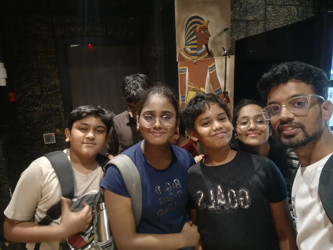
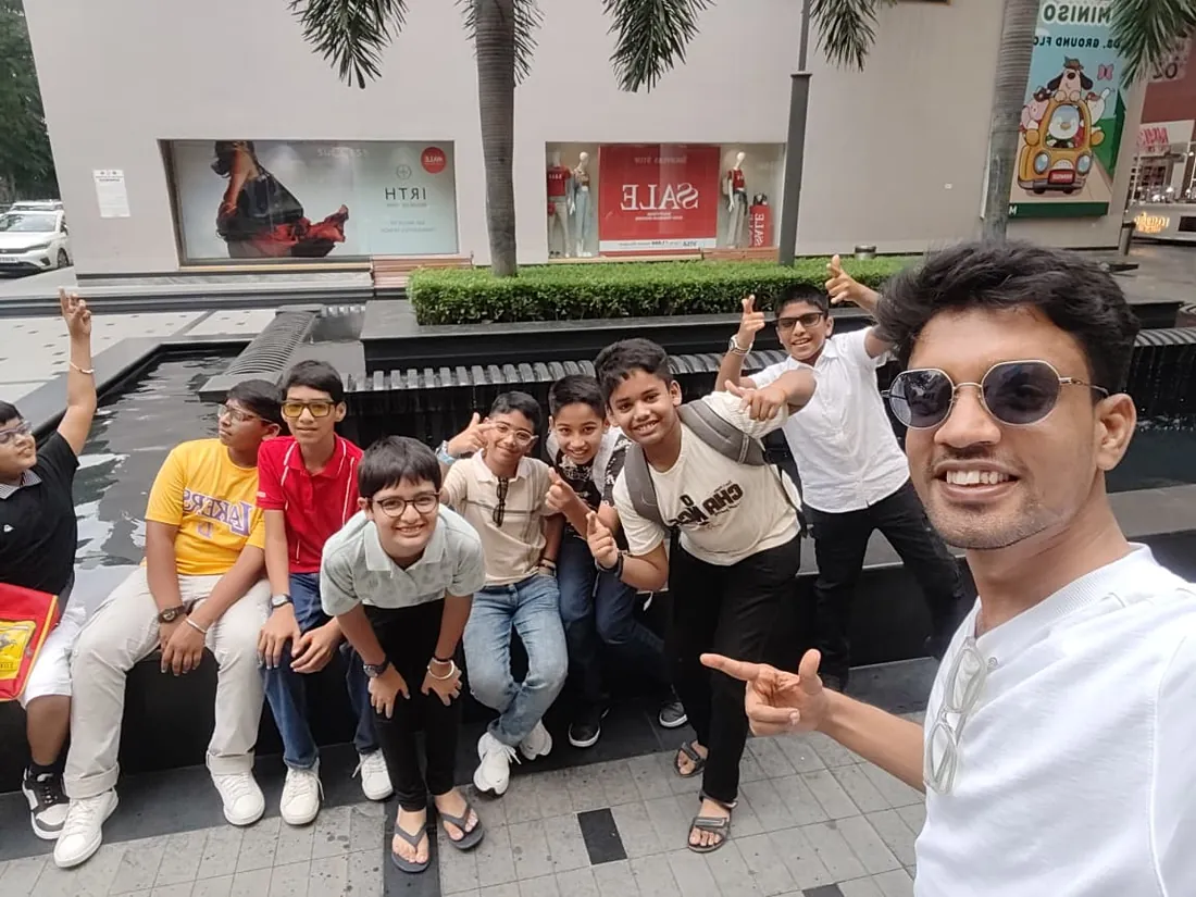
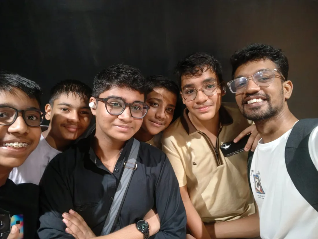
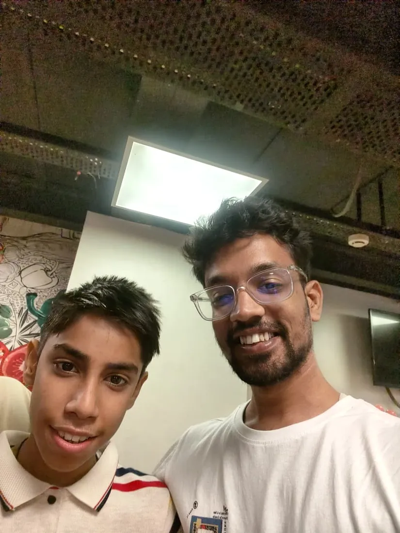
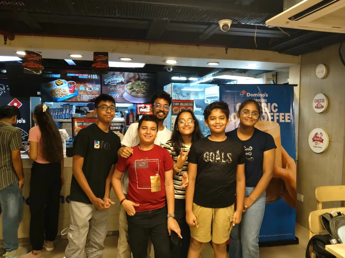
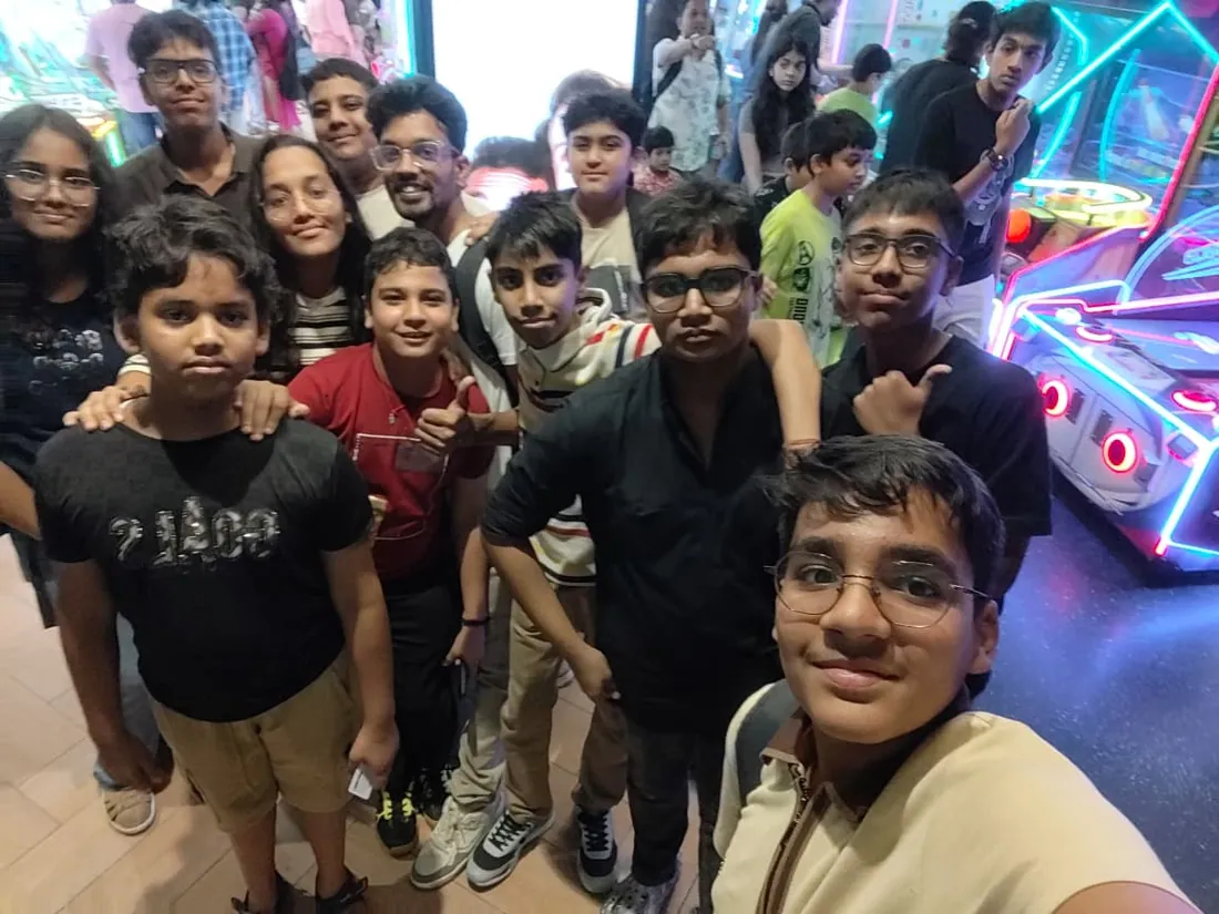
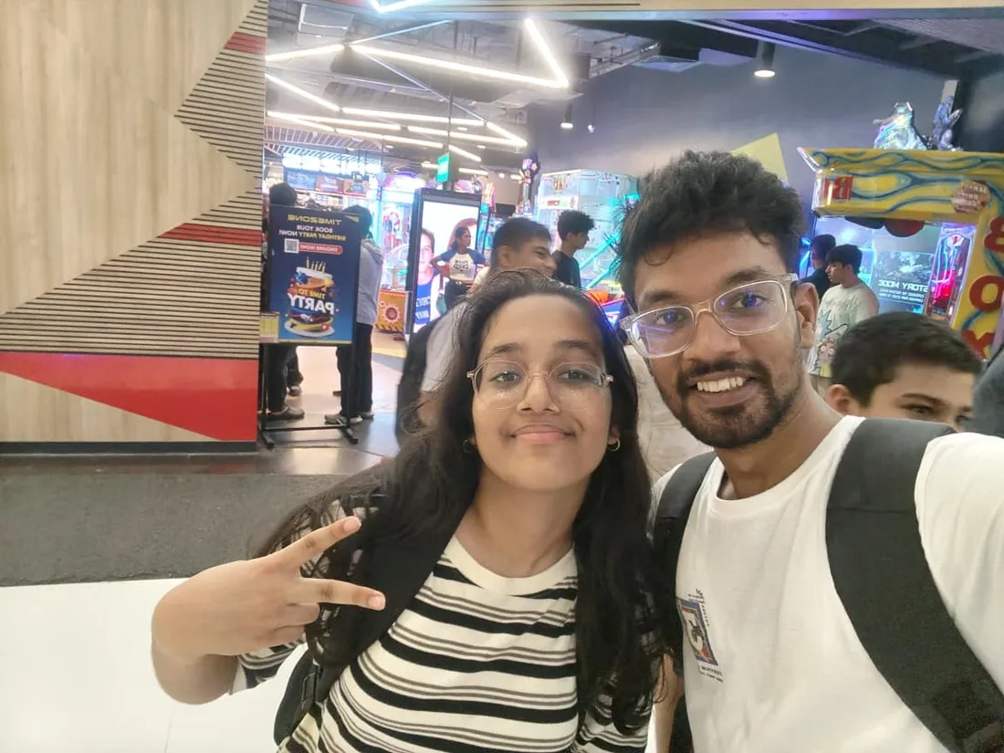
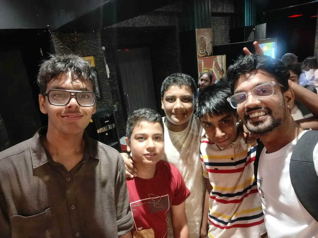
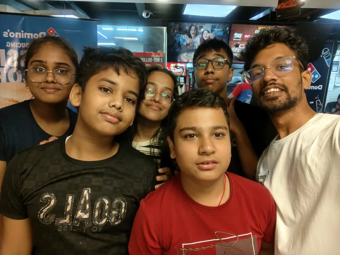
Real students. Real moments. Real joy.
These are our actual student meetups. No stock photos, no filters. Swipe through and meet the community you'll be joining.






















What families say
Straight from the parents and students who learn with us. Rated 4.9 across 547 Google reviews.
“Mivaan enjoys the class. He understands the concepts and completes his tasks with excitement. He started taking interest in coding… truly amazing class.”
“I absolutely love it here! I made new friends and learned important valuable coding skills while having the fun of my life. It's not just coding here, it's outings, bonding and most importantly preparing you for your future. Definitely five stars.”
“What stands out most is how excited my son is before every class. He looks forward to learning, problem-solving, and sharing what he's built. I've noticed a big boost in his confidence!”
“Modern Age Coders has been a game-changer for me! I struggled to grasp IT concepts and coding before joining, but their classes transformed everything. I'm now the topper in my class and can confidently write complex programs with ease.”
“Modern Age Coder have wonderful teachers who teach in a clear, easy and practical way. The teacher boosts students' confidence, keeps them updated with technology, and inspires them to learn without hesitation.”
“The one step solution for my son. Modern Age Coders make learning coding so simple that kids love it.”
“Coding classes here make learning very interesting and conceptual. The teachers teach us in a very easy-to-understand and efficient manner.”
“One of the most wonderful education centres out there. Education is not limited to school syllabus but focuses on skill development. Learning here has been a wonderful journey and still continuing.”
“I highly recommend this computer coding class! The teachers are incredibly knowledgeable and passionate about coding. They make every session engaging and insightful.”
“My child Dhairya is really enjoying the Modern Age Coder IT classes. This is his first online class, and he eagerly looks forward to it.”
“Very good classes. Don't worry about coding. They teach the best, especially Shivam sir.”
“Very good classes. Makes learning very easy and interactive.”
Hear it from our students
Real parents and students in their own words, on our public YouTube channel.
Straight answers about Orange Data Mining Course for Teens: Machine Learning Without Code
- Who should take this course?
- Beginner-friendly (ages 13-18), no programming experience required. It suits ages 13-18 who are interested in ai and data but have not learned to program yet, and do not want to wait a year before touching real machine learning; students preparing a science fair entry, school research project or ib-style investigation who need genuine analysis behind the poster rather than a spreadsheet chart; teens aiming at computer science, data science, statistics, economics or biology at university who want the concepts before the syntax.
- What will they learn and build?
- Most teenagers meet machine learning as a black box: an app that guesses the filter, a chatbot that answers, a recommendation that appears. This course opens the box, without asking anyone to learn Python first.
- How deeply are topics covered?
- The course runs 24 classes (12 weeks · 2 classes/week) at 3-4 hours/week recommended, across 5 phases listed week by week in the syllabus below. A structured, well-paced curriculum taught step by step, with hands-on practice in every session.
- Who teaches it?
- Modern Age Coders mentors, who teach the live classes themselves. You can watch them at work in the free class recordings before you decide.
- How do practice, feedback and assessment work?
- Classwork every session, a task after every class, monthly reviews that mix in earlier topics, and a final project defended live, plus a written assessment that decides the certificate: real knowledge and real work, with a free retest after revision if needed. Doubt support between classes over WhatsApp, so you are never left stuck. A certificate you earn by passing the final assessment, with a free retest after revision if needed.
- What does it cost?
- Three monthly plans: a group batch, a mini batch and 1-on-1. Prices are shown in your currency in the plans section. Monthly billing, cancel any time.
- When can classes take place?
- Live classes are scheduled around your week. Group batches meet at a fixed weekly slot; 1-on-1 students choose their own. International students are scheduled in their own timezone. Ask on WhatsApp for the current slots.
- Can I watch the teaching before deciding?
- Yes. Full recordings of real 13 and up classes are free to watch, free with a Google sign-in. These recordings show how we teach, not the exact syllabus of this course. Some classes are in English and some in Hindi; everyone follows at their own pace. Watch a class end to end, like you are in it. Sessions are interactive and each moment builds on the last.
- Can I enroll without a live demo?
- Yes. Choose a plan on this page and enroll directly; a booking or a demo is not required. A free live demo is optional, for anyone who wants to meet a mentor first. Outside India, our team confirms the plan and completes payment with you over WhatsApp, so allow a little time for that step.
Common Questions About Orange Data Mining Course for Teens: Machine Learning Without Code
Get answers to the most common questions about this comprehensive program
Still have questions? We're here to help!
Contact UsWhy Choose Orange Data Mining Course for Teens: Machine Learning Without Code?
Related Courses You May Like
Continue your learning journey with these recommended programs
 Data Science & Machine Learning
Orange Data Mining Course for College Students: Machine Learning and Analytics
Master Orange Data Mining in 24 live classes for college students: reproducible workflows, feature e...
Explore Course Web Development
Full Stack Web Development for Teens: React and Node.js
Full stack web development course for teens aged 13-18: HTML, CSS, JavaScript, React, Node.js, Mongo...
Explore CourseRelated Articles & Guides
Deepen your knowledge with these hand-picked articles
 Technology
26 min read
Technology
26 min read
Best Data Science Courses in India for Students and Professionals in 2026
Comprehensive guide to the best data science courses in India for 2026. Compare IITs, IIMs, online p...
Read Article Career
28 min read
Career
28 min read
Data Science, AI, and Math: Skills Every Tech Professional Must Learn
Master data science, AI, and math skills for 2025. Complete guide with skill assessments, learning p...
Read ArticleReady to start Orange Data Mining Course for Teens: Machine Learning Without Code?
Book a free demo class to meet your mentor and see how we teach, with no commitment. Or enrol now and start this week.